Film Fonts
|
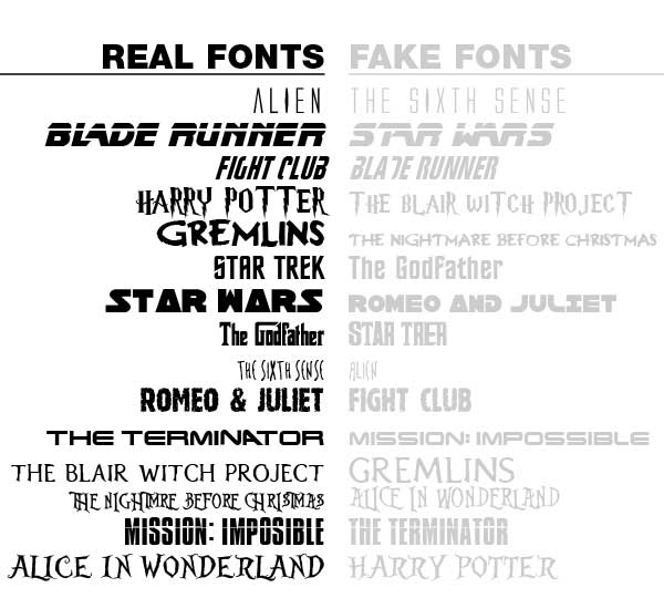
In many different OTS' the font choice is the incredibly important as it provides the feel for the film and what the film is about. If you chose the wrong font it can display the wrong signs which creates the wrong perception. The title is a very important factor in the OTS as it also reveals what the film is going to entail. For example, a psychological horror film would usually choose shape and spiky words whereas a comedy would be similar to bubble writing.
|
In our OTS we used fonts that represented floaty and eerie to show the theme was about dreams and the chaos that they can cause. For many of our colours we used black, white and other muddy colours that could represent concealed horrors hiding in the darkness.
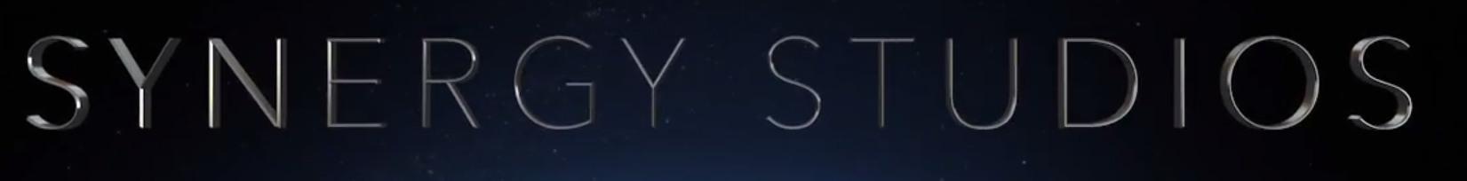
As our Distribution Company title we used a metallic, shiny font to convey a professional feel to our production. The shine and 3 dimensional effect makes the font bolder and links in with the background of stars and space.
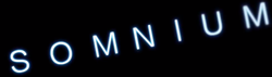
For our main title we used a font that represented floaty and eerie to show the theme was about dreams and the chaos that they can cause. For many of our colours we used a high luminosity and a bright sky blue to highlight a dream-like state in our OTS which is the main focus of our OTS. This also provided a contrast to the black background due to it's illumination.
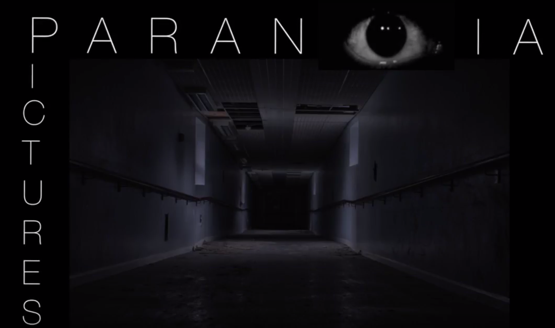
Our production company used a similar white colour to contrast the darkness and the dull and shady corridor that is in the background. The eye in the 'Paranoia' gives a unique and sinister relation to the horror genre.
